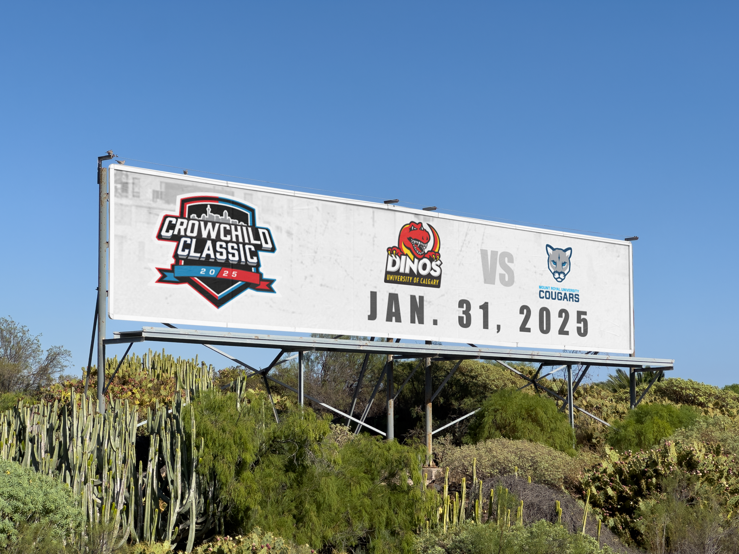
Crowchild Classic Rebrand
Redefining a Calgary Classic
Client: Mount Royal University
2025
Graphic Design
From Concept to Crest
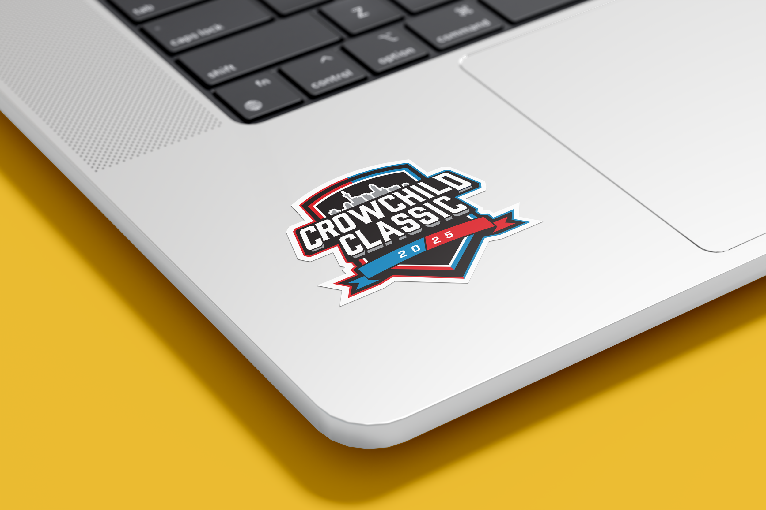
The Crowchild Classic emblem was designed with an iterative design approach based on finding a balance between tradition and modern sports branding.
Early sketches explored multiple emblem silhouettes before settling on a crest form that conveyed prestige and competitiveness.
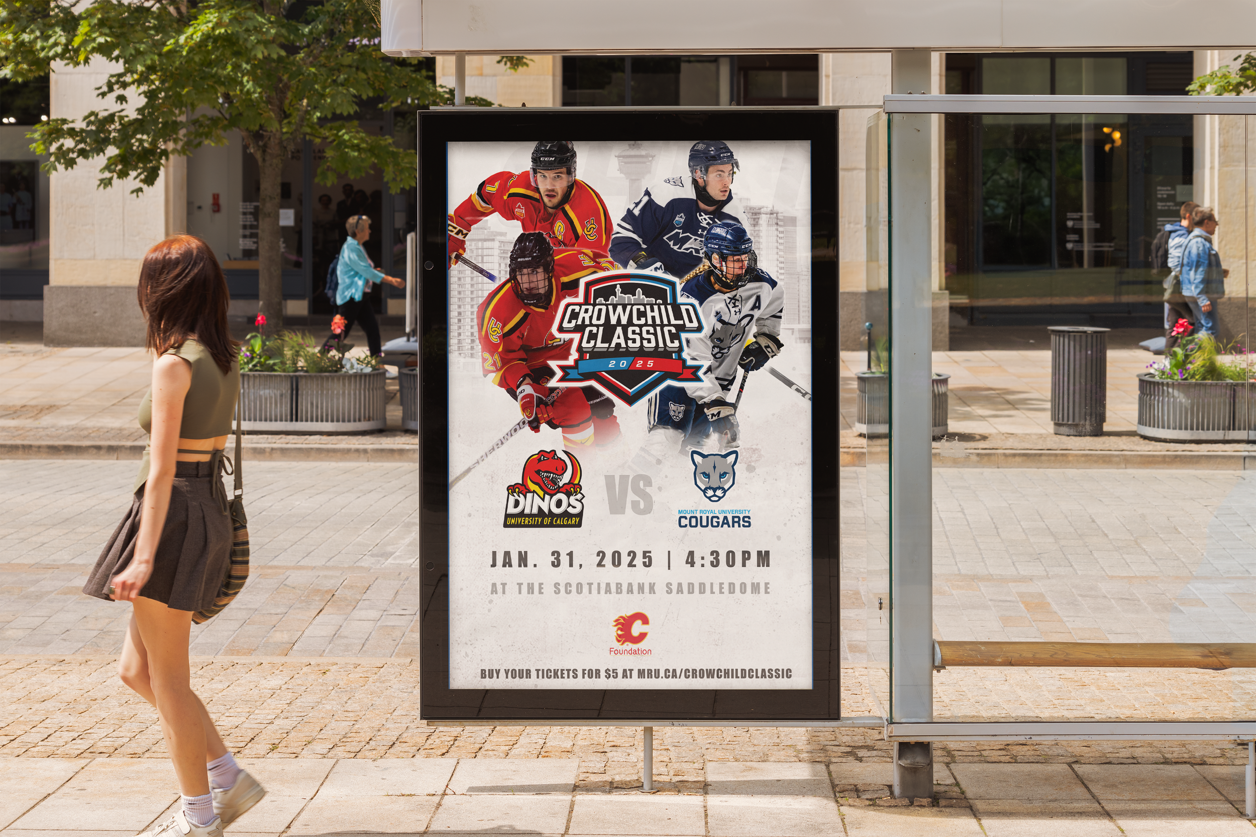
From there, I refined the typography, iconography, and colour system to ensure clarity at multiple scales, from large-format posters to digital and merchandise applications. The final emblem integrates Calgary’s skyline and team symbolism to create a unifying visual identity that feels both classic and modern, reinforcing the event’s role as a celebrated local tradition.