Mount Royal University Conservatory
Client: Mount Royal University
Wordmark
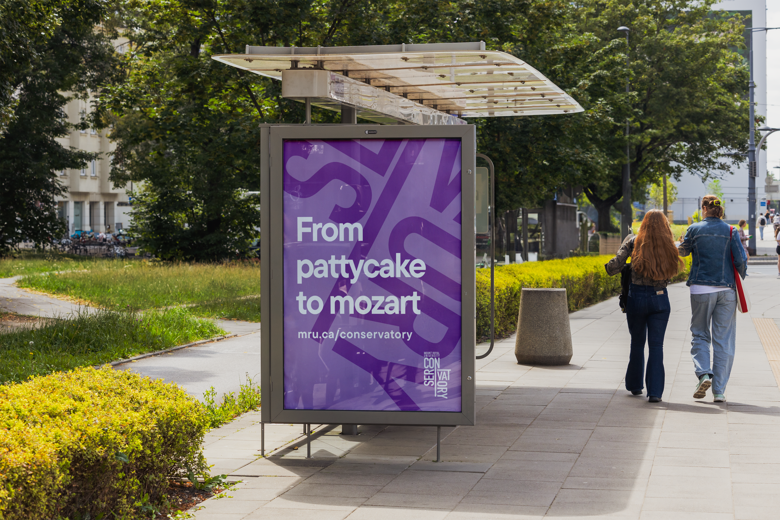
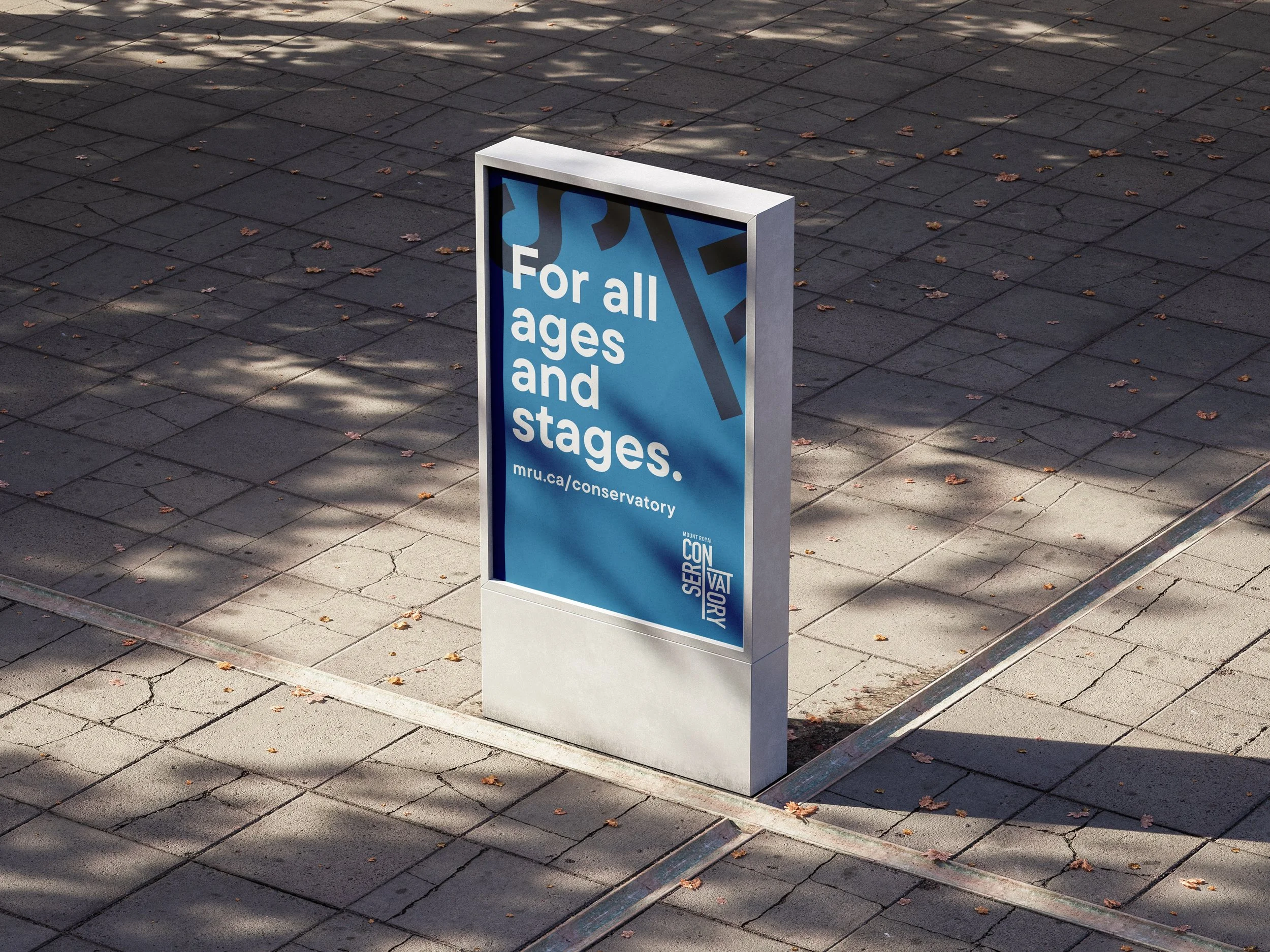
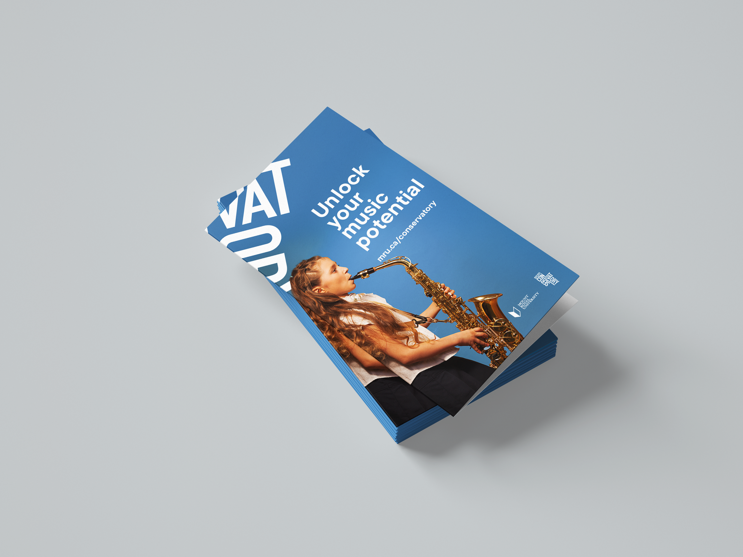
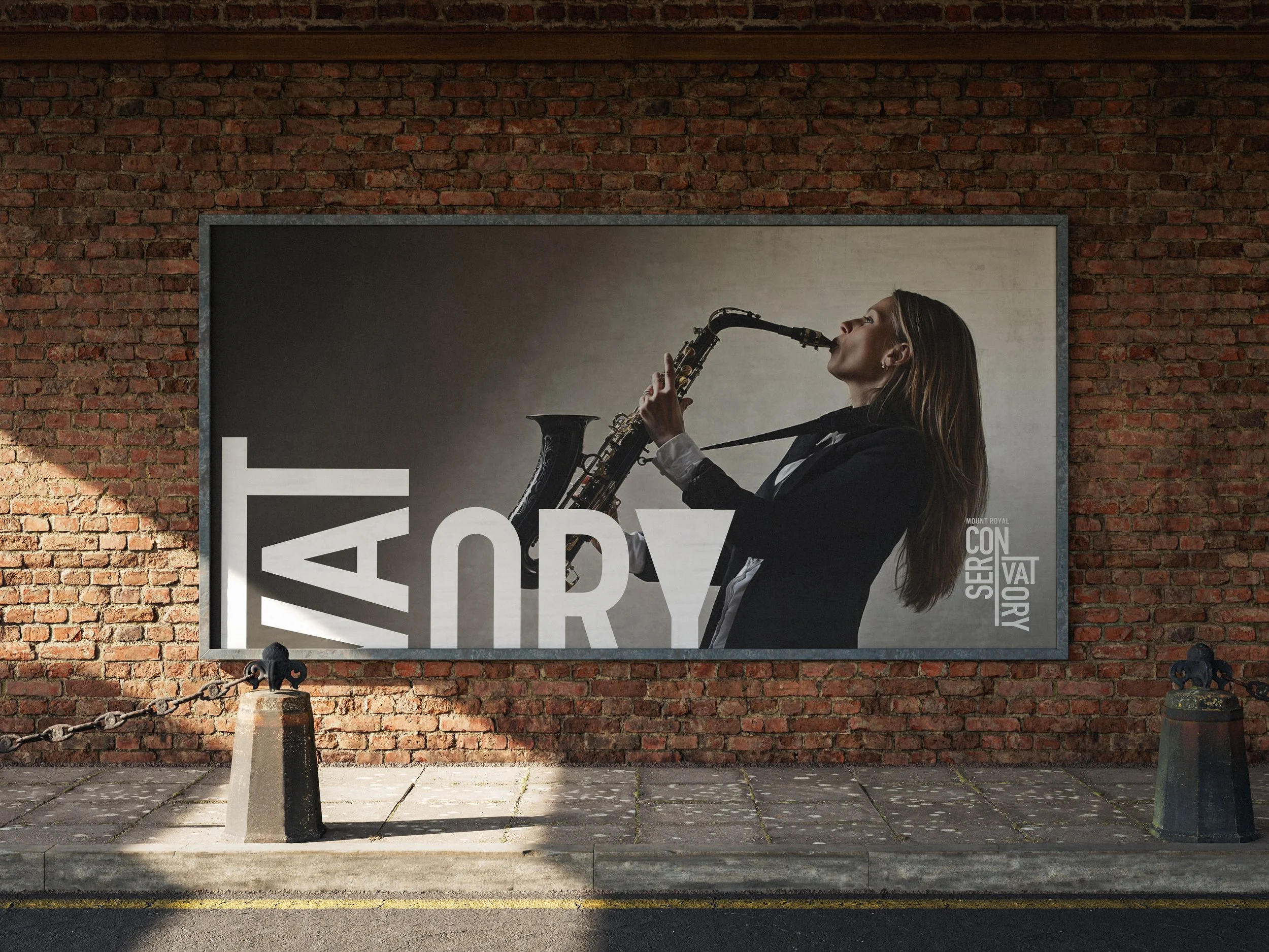
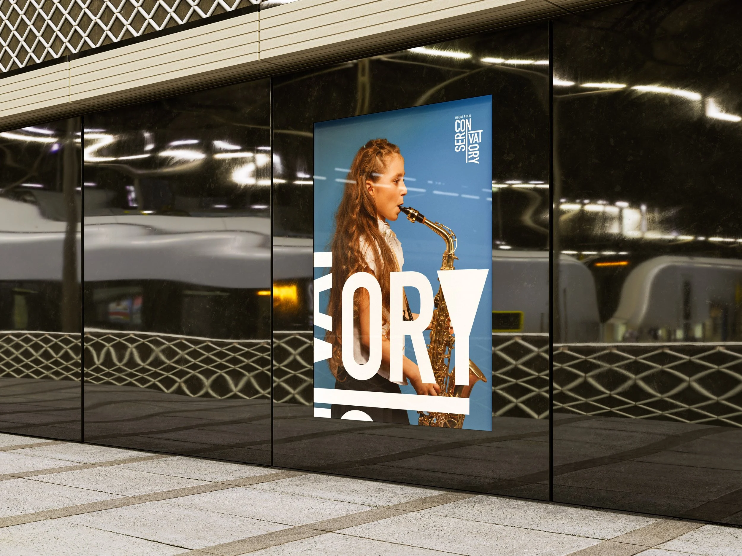
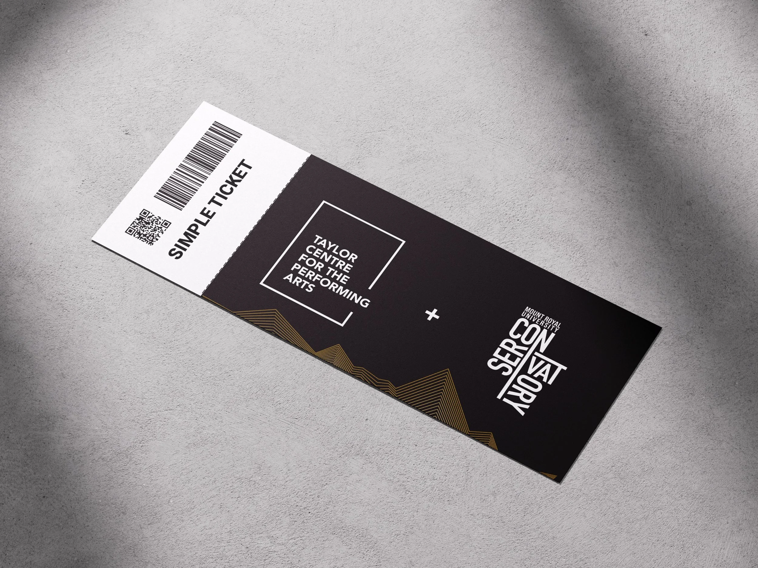
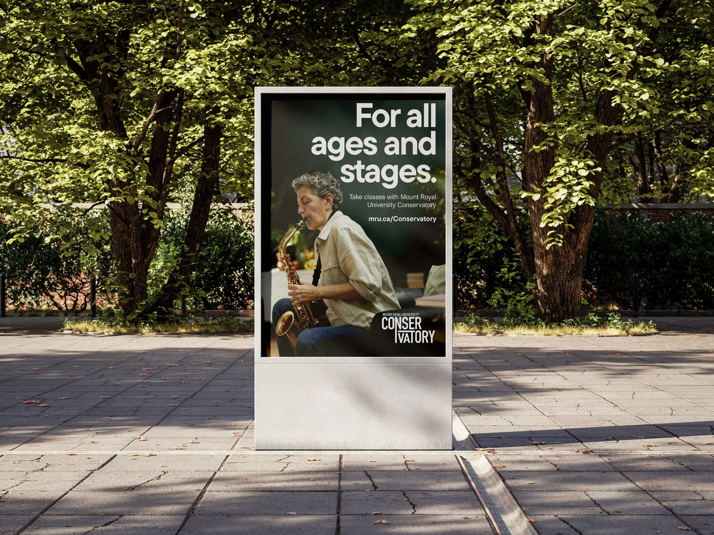
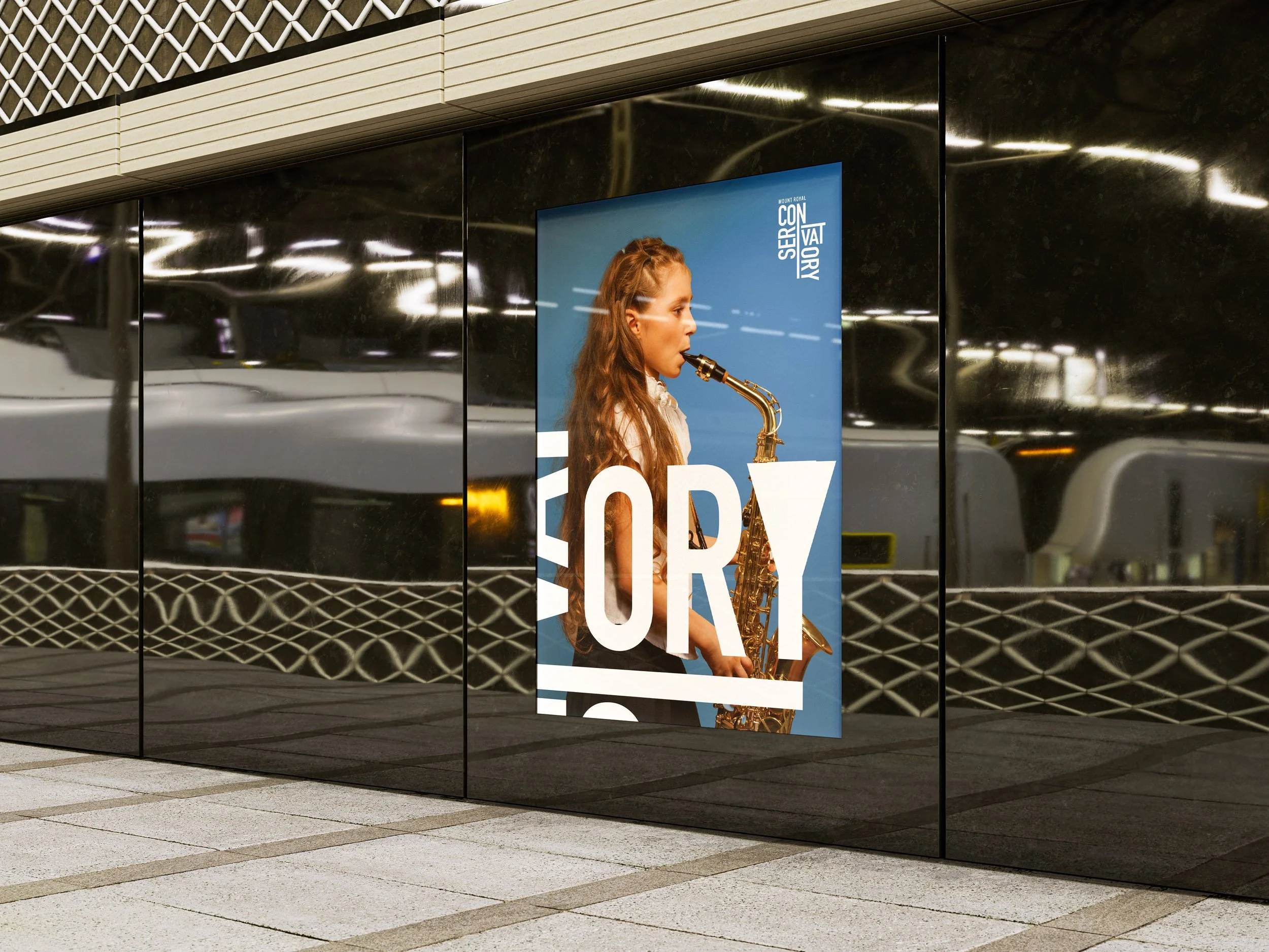
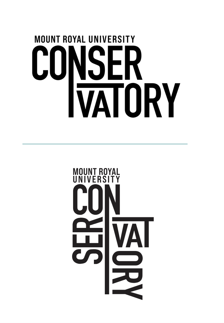
The wordmark design is clean, distinctive, and designed to set the Mount Royal University Conservatory apart. The letters face different directions, symbolizing the versatility and dynamic nature of the Conservatory. This variation adds an engaging visual element, creating a bold and unique identity that reflects the Conservatory’s commitment to creativity and excellence in performing arts education.
2025
Branding
moodboard and Ideation
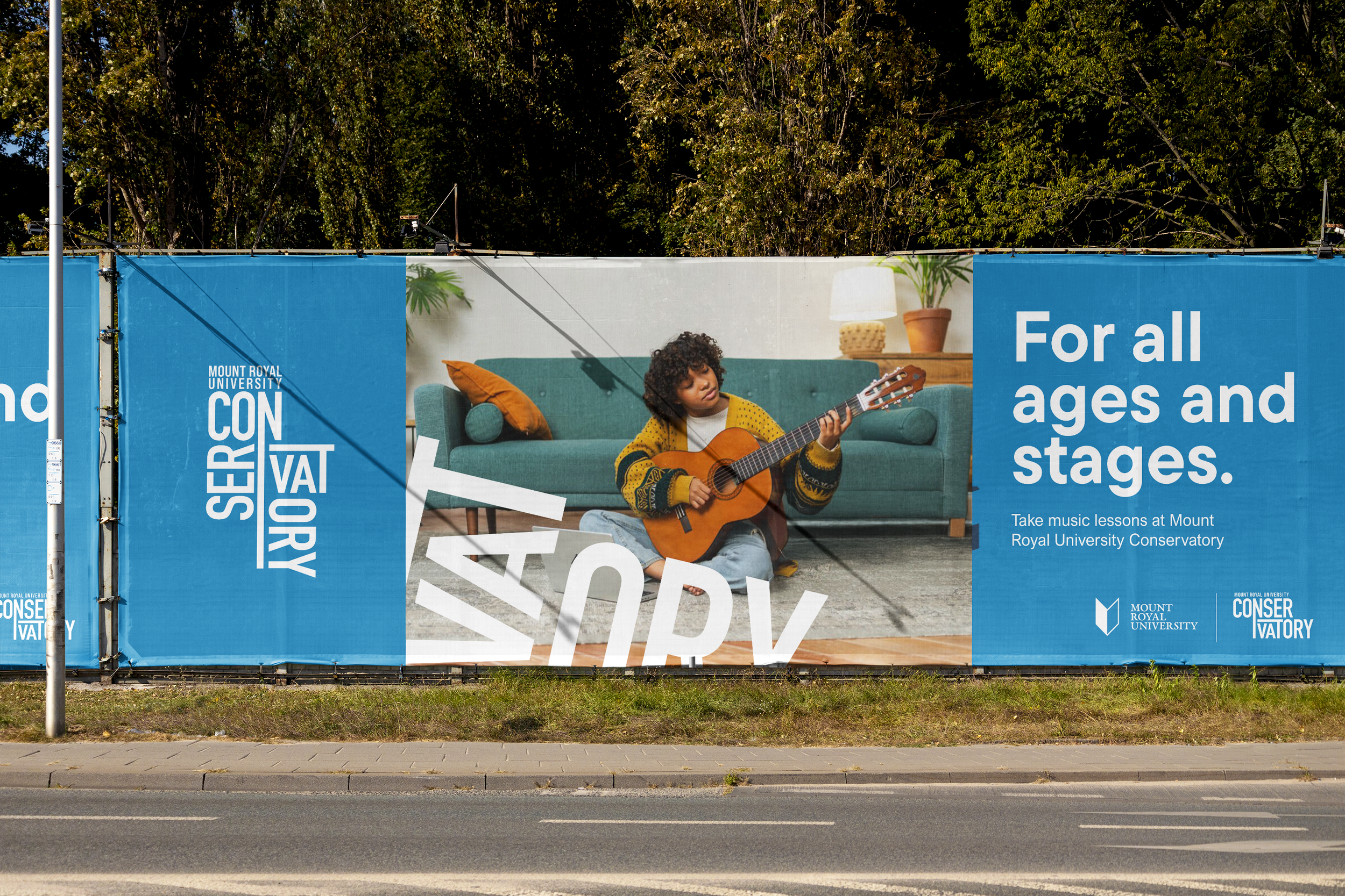
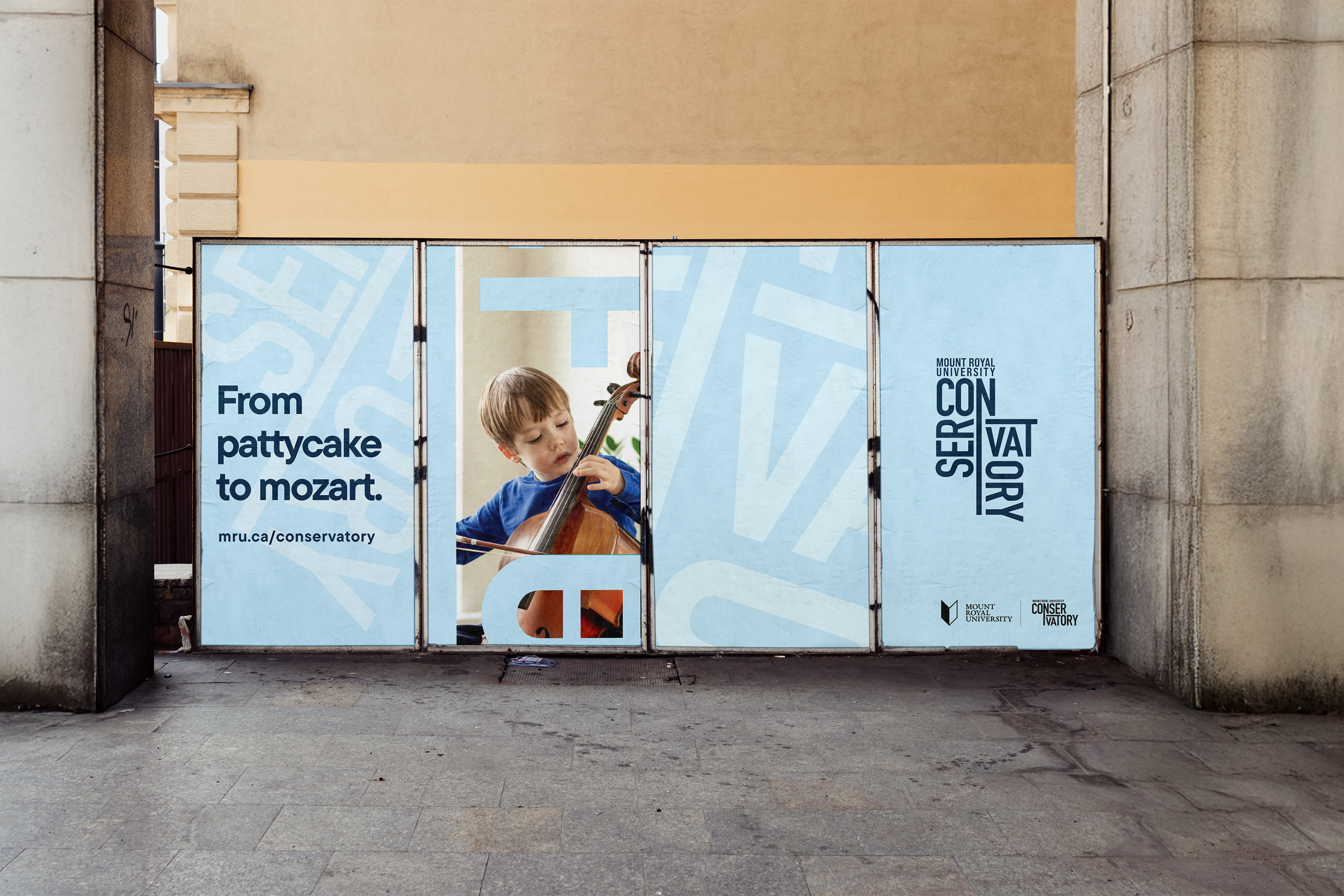
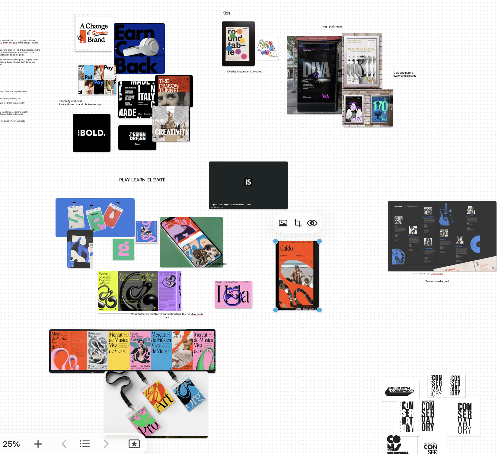
This project explores a new visual identity for the Mount Royal University Conservatory, designed to reflect the diversity, energy, and creativity of its music and performing arts community. The process began with a moodboard and visual research phase, where I studied contemporary editorial design and experimental typography to understand bold, expressive systems. These references helped shape an identity that feels playful yet structured, allowing the Conservatory to communicate across multiple age groups and disciplines. Through vibrant colour, graphic elements, and flexible typography, the final brand system was built to work seamlessly across digital, print, and promotional applications while maintaining a strong and recognizable presence
Visual elements
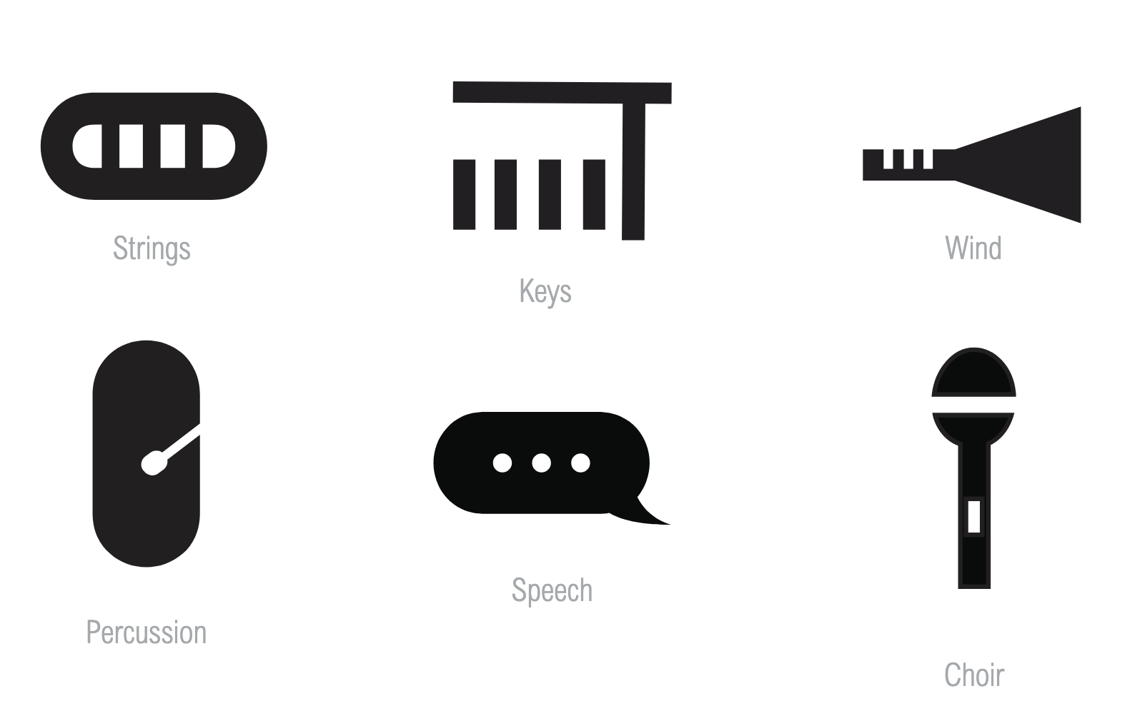
Each visual element is derived from the letterforms of the wordmark and assigned to a specific instrument category. These elements are applied consistently across image overlays and other visual applications to clearly communicate their associated category. This structured approach reinforces a cohesive and recognizable brand system while allowing flexibility across different touchpoints.